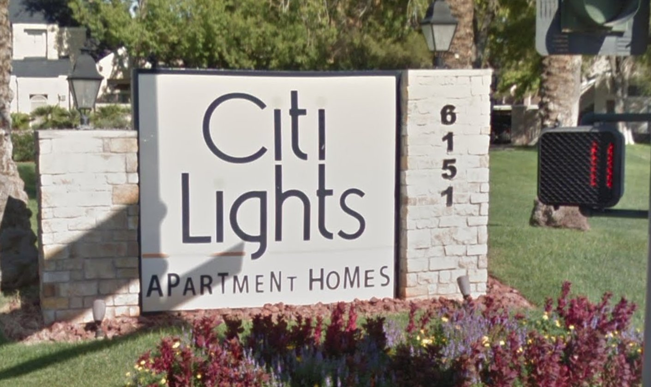
typographical abomination Show more
𝖠PᴬᴿTᴹᴱN𝖳 HᴼMᴱS
@Xkeeper What compels people to do this?
That S on lights looks slightly thinner than the rest as well. (maybe?) I really don't like this sign.
@BatElite its real bad.
Computer Fairies is a Mastodon instance that aims to be as queer, friendly and furry as possible. We welcome all kinds of computer fairies!


typographical abomination
@BatElite its real bad.