
This is an amazing document.
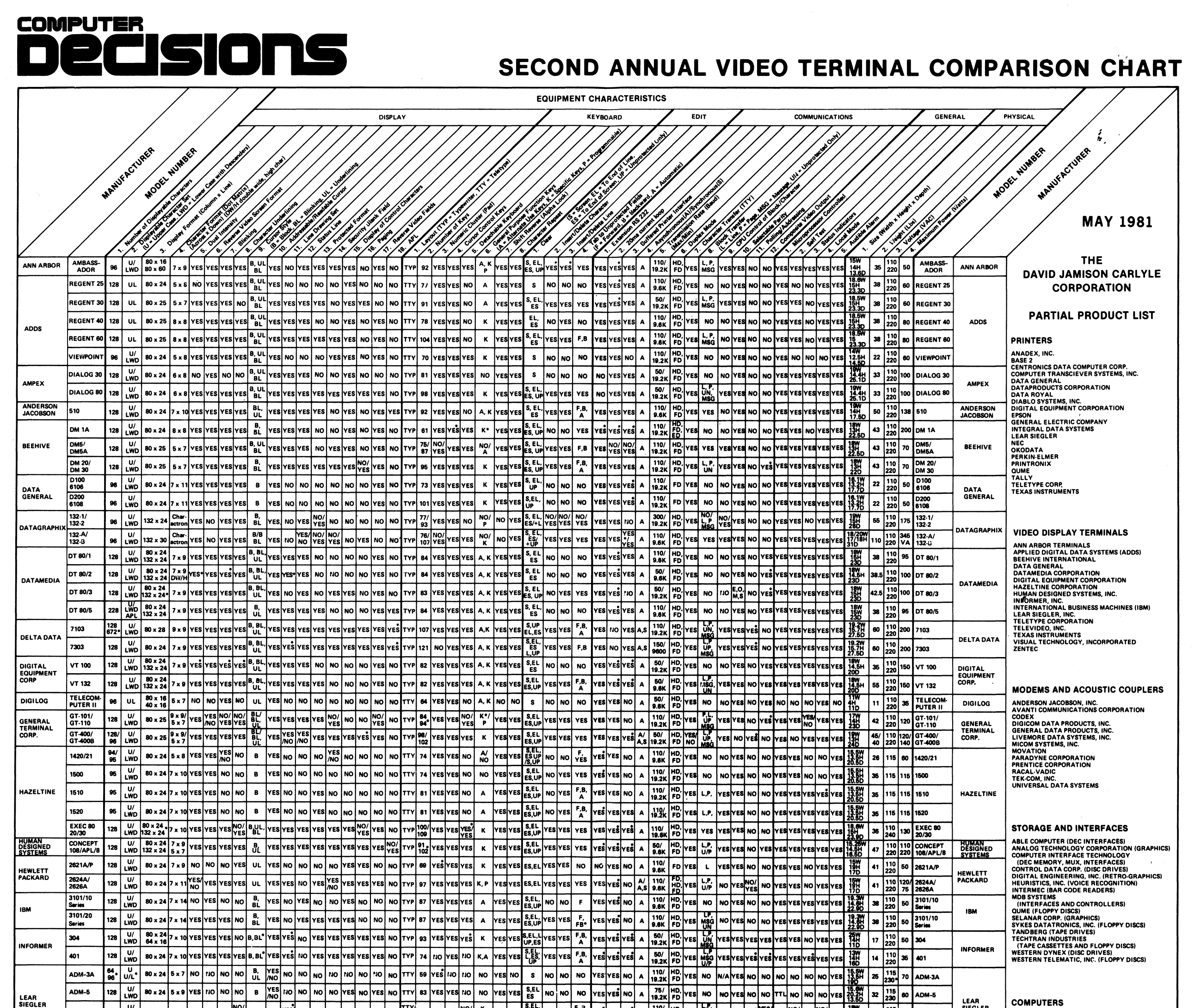
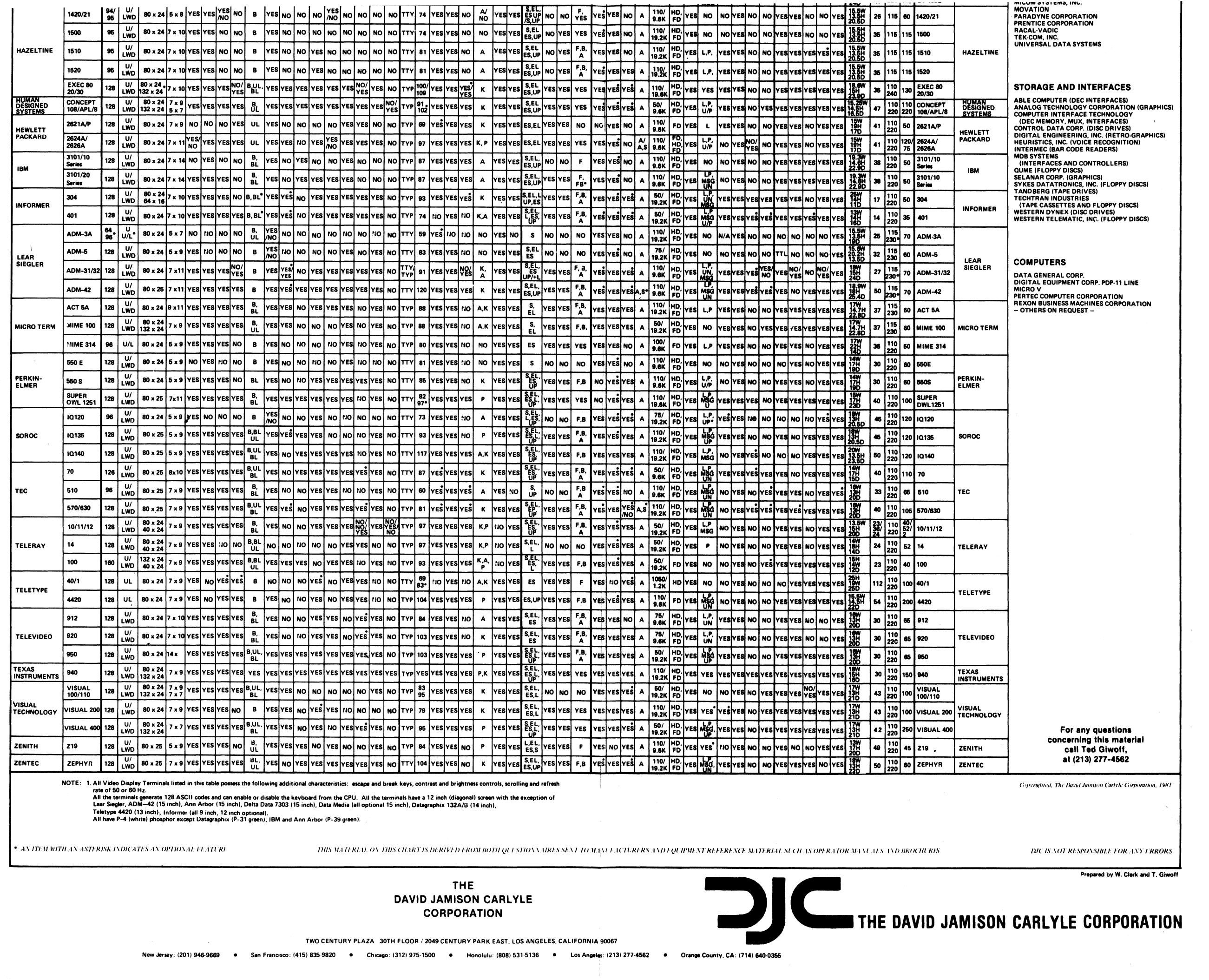
SECOND ANNUAL VIDEO TERMINAL COMPARISON CHART
Who said spreadsheets cannot be fun and look good
The closest I’ve designed something to this density is this, but it’s not even close.
https://aresluna.org/the-hardest-working-font-in-manhattan/recreations/
It would be great to design something online that feels like above. Retina displays allow for a lot of density, and you can imagine a nice interface where you can step between a larger overview, and something intense like this fluidly.
Part of me wants to make an online version of the above as an exercise now!


@mavica_again Looks so similar. Either the same person, or heavily influenced?
@mwichary that's why it jogged my memory!

@mwichary AHA i think it was this! https://www.lowcostminipcs.com