
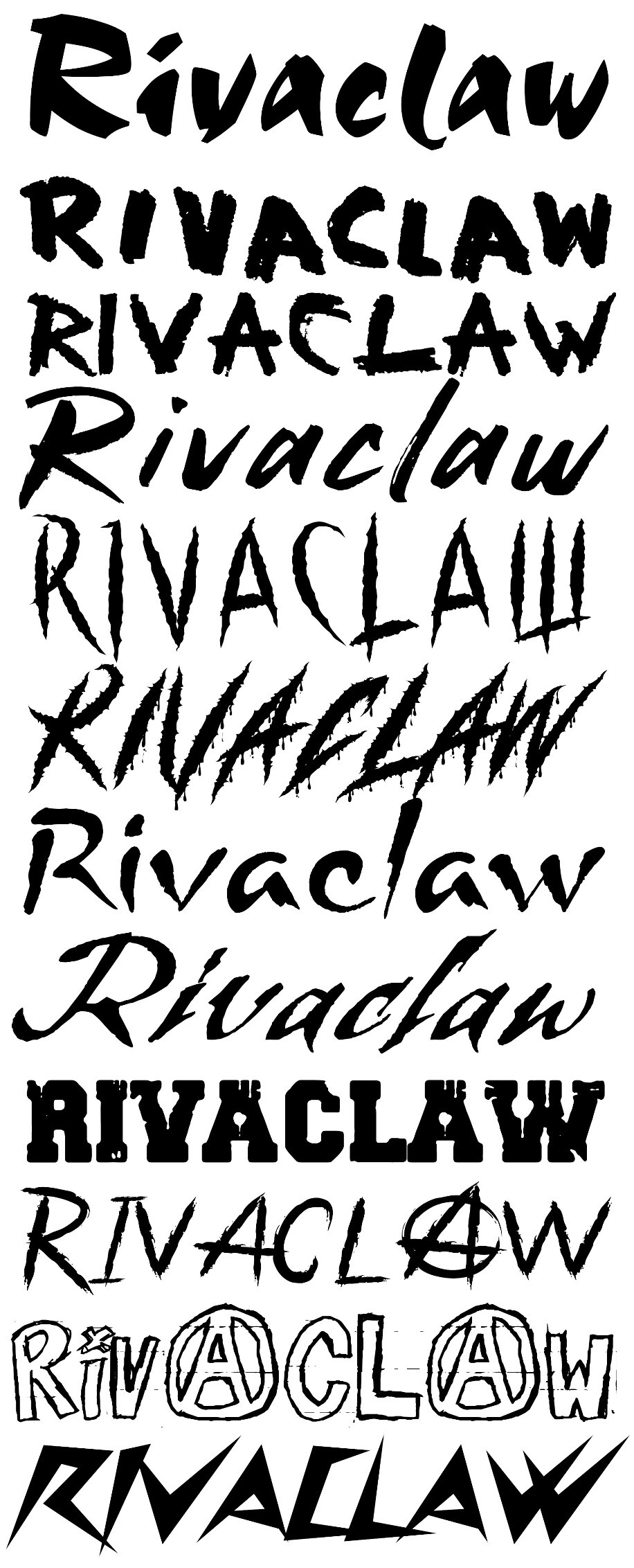
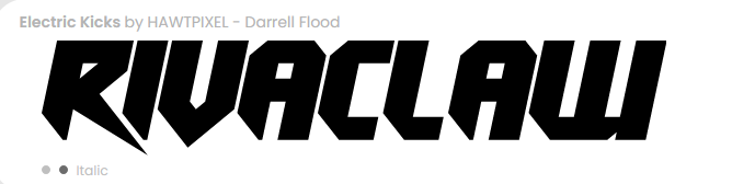
I'm trying to make myself a logo for my DJing (to put on posters, use as a thing for places like mixcloud, etc) but I can't decide on a font. These are the ones I've got as a "final" list. Which ones do people like?
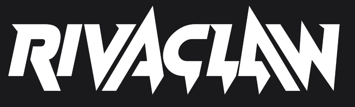
What do people think of this? c:

@renbymon I quite like the thinner ones, like the fifth and sixth ones, as they look like they've been scratched into being. I also like the tenth one for the same reason plus the Anarchy symbol. 💜 💙
@renbymon from the top, I like #5 and 6
@karyxdragon I also went for something a bit more rave-y too. What's your opinions on these?
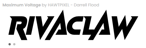
@renbymon I like Maximum Voltage.
@karyxdragon Thank you! <3
@renbymon The letter A in that High voltage really gives a lot of movement, it almost makes me think of people's hands in the air.
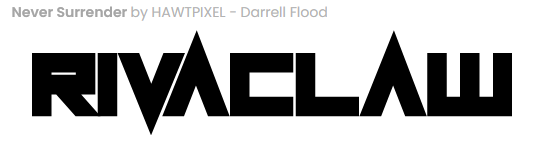
@renbymon number 4.
But flip the second A
@renbymon meant on the horizontal. But that works too!


@renbymon My vote is for the bottom one.
@renbymon looking good! <3
@renbymon Bet you could do a really funny "AWA" with that, too. :P


Also decided to look at some more ravey ones?