
Ren - Moved to chitter.xyz @Nine@computerfairi.es
- hugs
- ye
- Pronouns
- they/them preferred, she/her acceptable
- pawpaps
- soft, excitable and 24/7 availability
- Beepy
- /biːpi/ : verb, slang : a catchall verb that can describe any action, simply because it rhymes with "Sleepy"
yeah i'm moving over to chitter.xyz now. Soooo go there! I'm there now.
Joined Apr 2018
Ren - Moved to chitter.xyz
boosted

argonians are shaped like friends
Ren - Moved to chitter.xyz
boosted
what's your greatest weakness?
[ me, noticing the interviewer just ended their sentence in a question mark ]
nice try, riddler, but you'll have to do better than that
Ren - Moved to chitter.xyz
boosted

*gay screaming*
Ren - Moved to chitter.xyz
boosted


Ren - Moved to chitter.xyz
boosted

Hey!! My friend is trying to make me vibrate into the sun or moon gonna win.
redid that toot because heck i fuckin' typoed
it's raining
it's pouring
old rich white men are boring
FUCK i ty0poed
Ren - Moved to chitter.xyz
boosted

Daylight savings doubly so when I made it to me
Ren - Moved to chitter.xyz
boosted

Femail address
Ren - Moved to chitter.xyz
boosted


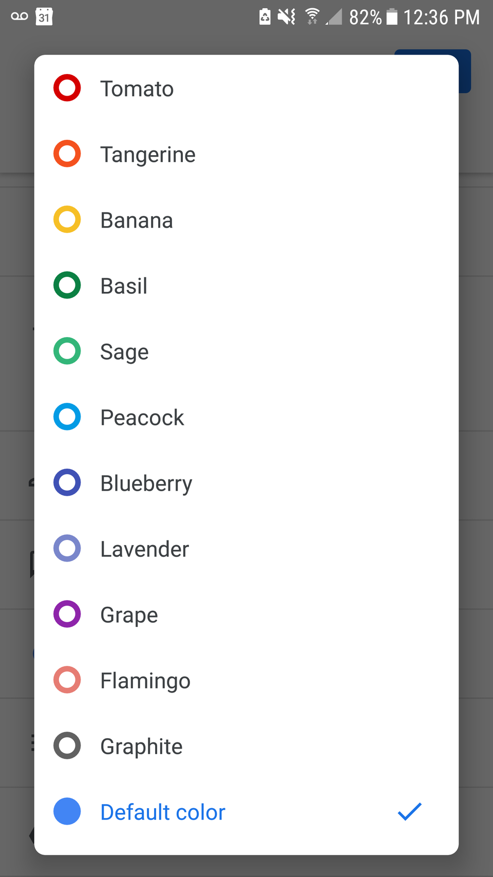
colorblind accessibility
A lot of color pickers present available colors as circles of that color. When you do this, bigger circles are better. The bigger the circle the easier it is for me to tell the colors apart. Including the color name does help a bit but I honestly prefer just being able to see what the color is. I've attached images of color pickers from two calendar apps. On the one with small circles and color names, most of the colors look the same to me, and the names don't mean much.
Ren - Moved to chitter.xyz
boosted

Ren - Moved to chitter.xyz
boosted

I got peer pressured in to making a poodle Zest (Zoodle)
Ren - Moved to chitter.xyz
boosted

Ren - Moved to chitter.xyz
boosted

Ren - Moved to chitter.xyz
boosted

Jaco gets up to fetch his credit card, returns instead with a banana. Looks at the banana, momentarily baffled. "Wait... I don't think they accept banana"
Ren - Moved to chitter.xyz
boosted

Chicken are tamed velociraptors. Send toot.
absolutely too sleepy to beepy ;;
gon snooz
Ren - Moved to chitter.xyz
boosted

so someone made a combination of tetris and picross
looks neat https://asfghost.itch.io/pixik
Ren - Moved to chitter.xyz
boosted


- hugs
- ye
- Pronouns
- they/them preferred, she/her acceptable
- pawpaps
- soft, excitable and 24/7 availability
- Beepy
- /biːpi/ : verb, slang : a catchall verb that can describe any action, simply because it rhymes with "Sleepy"
yeah i'm moving over to chitter.xyz now. Soooo go there! I'm there now.
Joined Apr 2018
