
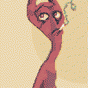
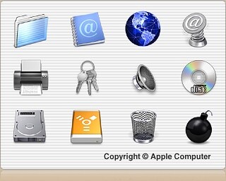
how would you make something like these old aqua wallpapers? 3d rendering? vector and gradients? i'm curious what the most "period correct" way would be. for that matter, what about the icons? the tutorials on how to make "aqua-like" pill buttons always felt wrong because the shading never quite followed the contour of the shape. how were they done back then, is it all hand-painted or is there a rendering technique i don't know about?
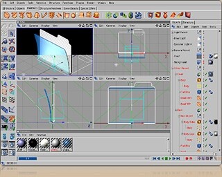
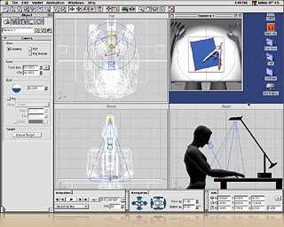
aha! looks like they WERE in fact 3D rendered! even to the point of using a human figure as an origin point for the camera to make it look like you were actually looking at a desk top
source: https://blog.cocoia.com/2008/the-origin-of-the-inimitable-icons/
this is actually a huge breakthrough for me. everyone i ever asked told me there was no way they would 3d render these, that they were all just vector drawings. i feel like i just found out the punchline to a joke everybody kept from me all these years


@mavica_again I hate not being professional enough. LoL

@mavica_again My understanding is that designers would create the 3D render *as a reference*, then recreate the icon (or at least draw over the render) in a vector drawing app, to precisely control the look—to not be chained to photorealism.
That’s the process I followed when making the Retcon icon; write up here if you’re interested, although I’m definitely not a professional: https://dribbble.com/shots/23104460-Retcon-icon
@thedaemon is that the name of the program?
CC: @mavica_again@computerfairi.es
@thedaemon here's the original page where that was scraped from, btw :) https://macintoshgarden.org/apps/cinema4d-xl-7
@thedaemon it's hard to tell at that resolution
i wish i could find any other source about this, but it was this hard enough to find out definitively that at least the OS X icons were actually 3D rendered and not vector gradients like everybody tries to imitate them with

@mavica_again @thedaemon This is news to me, I can't wait till tonight when I can pore over all this 🤩

@mavica_again I remember a very long time ago there was a couple pages about the design of aqua in an issue of MacWorld (I think it was MacWorld, may have been a different publication). Will have to see if I can dig it out.

@mavica_again that's awesome, actually.
I remember many tutorial looks for styles like that, and there was a lot that WAS done with combining many many layer styles in the era, but to see these shots of the process are really neat~

maybe the folks at @Iconfactory could share some insight on the techniques they used for their icons in the early os x days? :)