
Weasel @wildweasel@computerfairi.es
- the stuff i do
- https://netizen.club/~wildweasel
He/him. Puzzle-Adventure Hybrid with RPG Elements. Supports 3D Acceleration. He Is Essentially What He Believes. Just in case, 🔞, LGBTQ+ 👍, DOS 👌, 🐂💩👎.
Avatar by @mavica_again
Joined Oct 2017
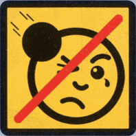
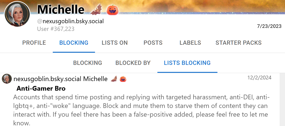
i feel like i have to laugh about this somewhere: i decided to check clearsky to see if i was on any blocklists on bsky, found i was on an "anti-gamer bro" list. looked up the user who created said list and checked out which lists they're being blocked by, and found they're being blocked by their own list (on top of a bunch of other ones intended to block far-right-wingers and other assholes).
i invoke Nelson Muntz:
👇HA😆HA👇
Weasel
boosted
Weasel
boosted

 🇪🇺
🇪🇺
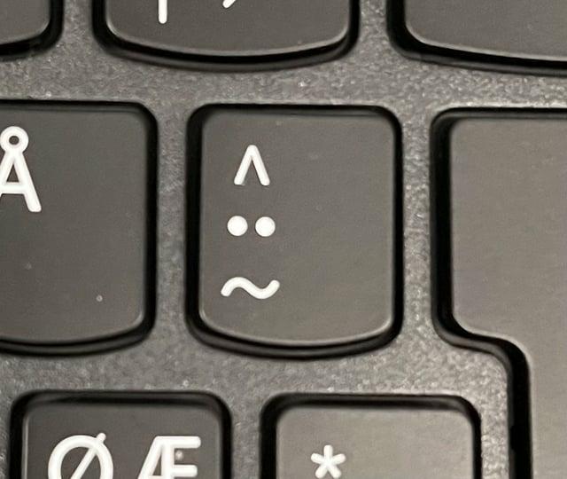
Nordic keyboards have a special key for my current mood ...
🇸🇪 🇳🇴 🇩🇰 🇫🇮
Weasel
boosted
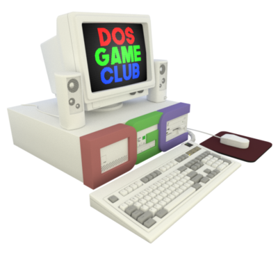
Joining @Tijn and @rnlf we are joined by @pix, who reviewed all 50 golf games in a mega-thread on our forums: https://www.dosgameclub.com/forums/topic/pixs-golfing-grand-tour/
Also joining the show is @wildweasel who is the maintainer of the excellent "Golfshrine Online": https://netizen.club/~wildweasel/golfshrine.html
The episode was edited by @console
Thanks to all who help us out, we can't do this without you!
Weasel
boosted
💾 NEW PODCAST!💾 Who hasn't enjoyed a nice round of golf on their computer? The slowly rendered trees, the random bird chirps, it's just like being outside!
We've done multi-game episodes before, but this one is our most ambitious yet, as no fewer than 50 games were discussed on our forums.
Some are text-only, some have all the multimedia features, but all are about golf!
Weasel
boosted
Weasel
boosted
Weasel
boosted
Weasel
boosted

Weasel
boosted

Weasel
boosted
Weasel
boosted

if you want to make Firefox's scrollbars bigger
visit about:config, and you can change these options:
widget.non-native-theme.scrollbar.size.override to change the width (and you can also set widget.non-native-theme.gtk.scrollbar.thumb-size to try to make it look nicer :neofox_woozy:)
set layout.css.scrollbar-width-thin.disabled to true to prevent websites from making the scrollbar thinner
widget.gtk.overlay-scrollbars.enabled to disable overlayed scrollbars, but this one can already be set in settings
Weasel
boosted

 Emmfoolery
Weasel
boosted

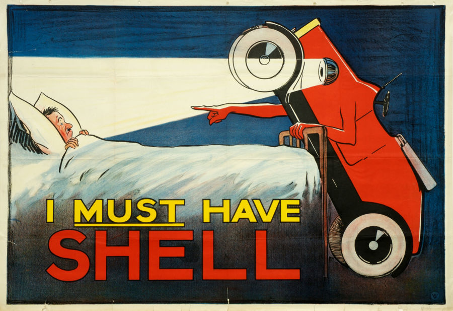
@fedward @futurebird by jove there's nothing i love more than to wake up to my automobile threatening me over its brand addiction https://nationalmotormuseum.org.uk/collections/shell-heritage-art-collection/explore-the-shell-heritage-art-collection/i-must-have-shell/
Weasel
boosted
Weasel
boosted
@ifixcoinops “you got ad problems I feel bad for ya son, I got 99 banners but your site ain’t one”
Weasel
boosted

I'm gonna replace my resume with a little card that says:
Foone Turing
Computer Toucher
I can touch computers for you in whatever way you want. I've been doing this a long while, I know how it works. There's no need to get more specific
Weasel
boosted
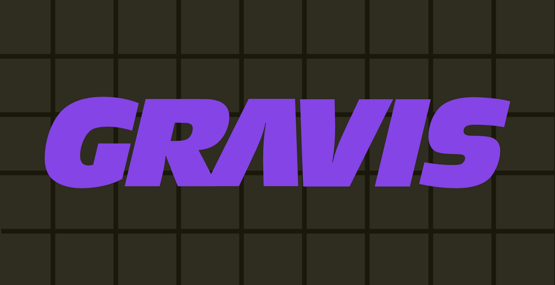
today's digital preservation project:
some might recognize the name Advanced Gravis from its incredible line of UltraSound sound cards, or maybe its classic joysticks and gamepads.
fewer know that this was a canadian company from burnaby, bc. its logo changed a lot over the years until the company's demise. unfortunately, wiki/logopedia/etc all seem to believe that its ugliest logo was its only logo.
so today i replicated the only Advanced Gravis logo that ever mattered: the one that graced my early-90s analog joystick and gamepad.
no one has ever properly researched the typeface for Advanced Gravis' logo. after some font ID magic, it turns out to be URW Type Foundry's Antique Olive Standard Compact Italic.
the A is swapped for an inverted V, which gives the logo that perfect sense of proportion and hi-tech slickness
designed in Affinity Designer. enjoy.
- the stuff i do
- https://netizen.club/~wildweasel
He/him. Puzzle-Adventure Hybrid with RPG Elements. Supports 3D Acceleration. He Is Essentially What He Believes. Just in case, 🔞, LGBTQ+ 👍, DOS 👌, 🐂💩👎.
Avatar by @mavica_again
Joined Oct 2017
