

Lizardsquid, maker of noises @lizardsquid@computerfairi.es
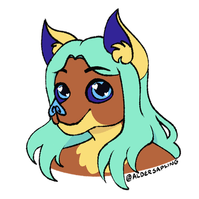
hi I'm avery, a cute lizardsquid with 3 hearts full of love!
nonbinary ░ they/she ░ australia ░ 29yo
I post: silly lizardy nonsense, world building, conlangs, doctor who
polyam, demi, open. I love affection!
hugs and cuddles and such are ok, but everything else please ask first
languages: English • Welsh (very basic)
I have a private account, ask for access!
(some old accounts:
@gwyfyndraig
@liquid_lizsquid
)
Joined Sep 2017
Affectionate at reader
@BatElite sleep softly, cutie
*snuggles you as you snooze*
@softgoat they're lampshading the arbitrary costs of items in capitalism
This is an April Fools joke (video version)
@BatElite cute~
@katshark *listens intently*
Lizardsquid, maker of noises
boosted
This is an April Fools joke
Hey I made a new game, or at least a demo for one! It's called Cavalier! :D
You're a knight who's out to save her mermaid girlfriend from being served as dinner!
website trends grumble
Also: I'm glad that they seperated out the classic series dramas and the new series dramas, that will actually help people a lot.
website trends grumble
ok, so they've launched the new site. There are still teething problems (stuff taking a while to load, links that don't quite work, etc), so I'll save most of my judgements for a week.
But I want to say a few things:
• Actually using the site feels mostly fine. Many things are much more usable than before.
• It looks like they've made an unnannounced change: renaming the "Main Range" to "The Monthly Adventures". I like the new name, but I wish they had said beforehand.
website trends grumble
They show this image for how it looks on a mobile site, which is fine. I *like* that the mobile site is simple.
But why not make the white centre (which you can see already has a pre-defined maximum width) be surrounded with the old grey? Add extra visual contrast where you can. Make the actual release area stand out.
website trends grumble
here's a mockup that I just made. Why don't they do this?
It's still exactly the same, but it looks much less bland and soul-less.
website trends grumble
Here's a comparison of the pages for individual releases.
The layout of the new page? Wonderful and amazing and good.
The aesthetic? Completely garbage. It's a generic store page.
Notice also: with the old site, there was a different banner at the top of the screen, depending on which series the release came from. In the new version?
It's just nothing. A completely white void.
(An aside: that big red bar isn't usually there in the old site, it's temporary)
website trends grumble
My problem with the new design: it just looks so generic.
Sure, make things big and flexible and stuff, that's good.
But it's just a white background. That lovely shade of grey is gone, and it's just a bog-standard white.
The banner at the top is gone, replaced with.... bog-standard white.
Instead of a variety of colours, there's 3 and a bit.
It just looks like a completely generic store page.
website trends grumble
Big finish is updating its website soon, and in some ways it's really good (it's going to be much more useable on mobile devices), but I have a problem with the design.
Pics for comparison (current design on left, new design on right)
selfie
@foxiepaws@otherkin.club you're cute ♥
Love/relationship (+)
@LottieVixen @lightdark that's great ♥
silly, clothes
@page@slime.global @LottieVixen oh my gosh you're adorable
programming adjacent
or honestly, just a discord for functional programming in general
programming adjacent
me: *is making tea*
my brain: you should start a discord for LGBTQ+ functional programmers
me: what? no.
me: ... actually, that sounds like it could be good
Affectionate
@BatElite *purrs happily as I snooze in your wings' embrace*
sleepy time, I think...
the idea
@BatElite eeeeee ♥♥♥
hi I'm avery, a cute lizardsquid with 3 hearts full of love!
nonbinary ░ they/she ░ australia ░ 29yo
I post: silly lizardy nonsense, world building, conlangs, doctor who
polyam, demi, open. I love affection!
hugs and cuddles and such are ok, but everything else please ask first
languages: English • Welsh (very basic)
I have a private account, ask for access!
(some old accounts:
@gwyfyndraig
@liquid_lizsquid
)
Joined Sep 2017
