

Lizardsquid, maker of noises @lizardsquid@computerfairi.es
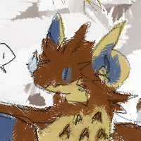
hi I'm avery, a cute lizardsquid with 3 hearts full of love!
nonbinary ░ they/she ░ australia ░ 29yo
I post: silly lizardy nonsense, world building, conlangs, doctor who
polyam, demi, open. I love affection!
hugs and cuddles and such are ok, but everything else please ask first
languages: English • Welsh (very basic)
I have a private account, ask for access!
(some old accounts:
@gwyfyndraig
@liquid_lizsquid
)
Joined Sep 2017
page design, opinions wanted!
I tried to use less saturated colours + distinguishing shades between each row, but that's even harder to read, I feel
page design, opinions wanted!
A lot of people seemed to think the colours meant something specific, that also wasn't in the text.
But it was just a correspondence thing - if the text said "yes" then it was one colour, if the text said "no" it was a different colour
why did I ask for advice lmao, everyone's recommending something completely different
page design, opinions wanted!
I'm making a guide for doctor who, and I was wondering how I should format the page - at the moment, I've got a high details mode and a low details mode - any opinions/critique on the design would be much appreciated, though!
job search
yay, finally someone sent me a response!
I mean it was a "no", but at least it was a response instead of just silence...
helllooooooooooo
Lizardsquid, maker of noises
boosted

 maple classic™
and now it's time to snooze~
board games
board games were fun!
we played Dominion, Ascension, and Colt Express
hello I am here
Lizardsquid, maker of noises
boosted

Protip:
When designing a user interface, imagine some old woman using it, say Margaret Hamilton, and she's clicking your app's buttons and saying to you, as old people do,
"Young whippersnapper, when I was your age, I sent 24 people to the ACTUAL MOON with my software in 4K of RAM and here I am clicking your button and it takes ten seconds to load a 50 megabyte video ad and then it crashes
I'm not even ANGRY with you, I'm just disappointed."
I'm here for a short time before board games
polyam, ++++
Seeing two of your partners become partners with each other is so wonderful and amazing <3
Lizardsquid, maker of noises
boosted
PDA
Eeeeeeeeee I love @chao@chitter.xyz!!
She is sweet and caring and patient and very very cuddly and lovely and she deserves love and hugs and nuzzles!
What wonderful and kind people I'm surrounded by~
(also that might be an outdated colour scheme for her, but I was going by memory mostly.)
We're partners now. :3
I'm gonna go fold the clothes so I can go to sleep
goodnight-ish~

I've decided to block the image bots, images stress me out too much and having a bunch of them show up on my feed isn't great for me
but I hope you all still enjoy them, of course ♥
hi I'm avery, a cute lizardsquid with 3 hearts full of love!
nonbinary ░ they/she ░ australia ░ 29yo
I post: silly lizardy nonsense, world building, conlangs, doctor who
polyam, demi, open. I love affection!
hugs and cuddles and such are ok, but everything else please ask first
languages: English • Welsh (very basic)
I have a private account, ask for access!
(some old accounts:
@gwyfyndraig
@liquid_lizsquid
)
Joined Sep 2017
